About Me

My photo
I'm a student that studies. Send money for food.

Friday 30 November 2012

Which scene to remove?

As my final part of my audience research I asked people which scene they thought I should remove from my short film in order to keep it within the time limit of 5 minutes. I asked them to rank the scenes in order of preference, 1 being the best 8 being the poorest.

Working on averages over the all of the responses, here is what the results were:

1.    The sign communication
2.    Running in the park, the male falls over
3/4. Spinning, male gets hit by a car & Having dinner
5/6. Playing on the Wii & Walking the dog
7.    Watching the film
8.    Feeding the ducks


These confirms what I thought. The duck scene is clearly quite weak, it doesn't particularly add to the narrative or play on any romantic-comedy conventions. I thought so and so does my audience. For these reasons I will be removing it for my final edit.

If I still need to remove another scene it will be the couple watching the film. I am reluctant to remove it as several audience members responded really positively. Plus on the recommendation of the people I asked in my video feedback I have shortened several shots during various scenes within the dream sequence. This includes the complete removal of one shot during the dinner scene where the couple are just unwrapping their chips.


So, in conclusion:


Thursday 29 November 2012

It's about time: Feedback footage.

I have finally had time to edit the footage of my individual audience feedback! Here it is:


I found this really helpful as it gave me a chance to ask people what they thought without them being influenced by other peoples opinions.

My response to some of the comments:

Question 1: What do you think?


"I like the narrative of it" ..."I would prefer if it had a nice happy ending" - I'm glad the narrative comes through strongly. I was fully expectant for some people wanting a happy ending but that doesn't really fit with the parody genre, I waned to play with the unexpected. Also, it was a strong point of the story: If he hadn't of spent the time dreaming and rather acted upon it, he would have had that happy ending. 

"It plays with some of the rom-com cliché ideas" - I was very glad to hear that this audience member had recognised some of the clichés I was trying to parody. 


Question 2: Which was your favourite scene?


- The KFC scene 
- All of the dream sequence
- The movie scene
- The running/He falls over scene

I was surprised to see the movie scene come up in this question as I thought this was one of the much weaker scenes. This has given me cause to perhaps re-think as I was fairly certain this was a scene to remove. 


Question 3: Which scene/scenes do you think I should take out?

- Shorten the swinging round scene
- Shorten the running and the fall
- The car scene
- Shorten in the bar (coffee shop)

It was interesting that 50% changed the question and suggested shortening the scenes rather than removing any. This suggests that all of the scenes are worthy of keeping in, in their eyes. Furthermore it could signify that none of them were bad enough to warrant their removal. But, equally the weaker scenes may have just left no impression. 
I will not be removing the car scene. I think, especially the start when the couple are spinning, are really effective. I appreciate the feedback but on this (rare) occasion, will be ignoring it. 


Question 4: Would it make more sense to have the clips in chronological order?


- "I don't think so"
- "I don't necessarily think that as the audience I'm aware of if they're in chronological order or not"
- "Definitely"
- "I think I would like that"

A split opinion on this one. However I believe it does make more sense to place the dream sequence chronologically,  as if it is happening over the course of a day rather than in pieces  Plus, with the abruptness of the answers answering 'yes' it seems like something the audience would benefit from.


Question 5: When the male gets hit by the car, is it ok in slow motion or do you think it would be funnier if he got hit at full speed?


"You could do the thing where they do a fast thing and then they repeat it and do it slow" - I hadn't thought of this and I think I can visualise what she means. However, with my film already over the allotted 5 minutes I don't have the duration to really be adding in anything else. Plus, I think this gives the audience time to dwell on what has happened, taking away the shock factor. 

"experiment with it" - this wasn't such a helpful comment as I have experimented with it and i'm still not sure. Hence I was asking the audience. 

"It looks a bit odd with the rest of the film being in normal motion" - I think this point is probably down the that in particular persons preference. When the comment is thought about, on that logic slow motion would never be used unless an entire product was in slow motion. But I see what he means. Perhaps with more advanced software and visual effects it could work, but I don't have the facilities or skills to produce it. 

"I like the idea of fast and full speed because it's abrupt and you don't expect it" - I agree with this. I think I will speed up the footage as fast as is possible without if looking jumpy and disjointed. 


Question 6: Any other comments?

- Maybe put in harry's thoughts

This is a good idea. But I like the fact that there is no input from any other character; the entire film is from the first males point of view. 


This is nearly the conclusion of my audience feedback. I will be asking some more people for their opinion on what scene to remove to get a really clear idea of what the audience want to see. 


Wednesday 28 November 2012

Film poster development

I was looking at my film poster yesterday and I'm not happy with it. I have changes the photo as suggested from some feedback as the previous one was of poor quality. I know I wanted a plain white background to mirror posters of pre-existing romantic comedies. But with the placement of pictures in it's current state it just doesn't looks very professional. So, I though I'd experiment with adding a background. But, being as the poster isn't in a location a background would be tricky to add. I needed something related to the narrative but the location wouldn't necessarily work. This is because a location photo would need to be of a location from the film. I no longer have access to the location of the coffee shop so it's not really an option. Instead, as a test I opted for some coffee beans as it relates to the location and the name of the film.

Here is what I tried:


Before
After

I'm not sure I like it. It looks very, very artificial and unprofessional. I don't think adding a background is the answer. I plan to change the position of the photo instead, perhaps so his head is half of the page. I think this is a problem only experimentation can solve.


Tuesday 27 November 2012

Peer assessment feedback

After making some of the suggested changes to my film today I received some peer feedback. Two members of my Media Studies class watched my film them commented 3 key areas:

  • Cinematography 
  • Mis-en-scene
  • Editing
They would also have commented on sound but my current edit doesn't have any. I will re-record and add in the audio when the visuals are finalised. 

Here are the comments my film received and my responses:

Cinematography

Strengths
"So many good shots, particularly like the bit on the sofa which pans across the two of them"
"I really like the shots of the couple spinning around."

Suggested changes
"Add an extreme close up when he sees her eating the chicken" - I don't think an extreme close up is needed here as his emotions aren't very complex. Plus, his head movement adds to the disgust he is conveying.  
"Camera shakes when he looks at the coffee" - The camera does shake a bit here, but as this is a point of view shot it reflects the head movement of the character. 

Mise-en-scene

Strengths
"Hard to get a spoof right but you did it well by using all the typical conventions."
"The paper sign with '£6 for a taxi' is really good."
"The candles you put on the table creates a romantic atmosphere"

Suggested changes
"You could darken the lighting (a little bit) when they are watching a horror film" - I was conscious of making sure the shot was light enough to make sure everything was visible. I will try making it a little bit darker, still so it is visible but low-key enough so it adds more to the tone

Editing

Strengths
"It is clear that it is his imagination when he looks up and it fades to white"
"Good editing throughout by reversing between characters"
"The quick pace editing at the park is very effective, it portrays his 'clumsiness'"
"The pace at the station is quite slow, which builds up the anticipation"

Suggested changes
"Have the car crash slower or faster" - This is something I've spent a lot of time thinking about. I think faster is definitely better as it doesn't give the audience time to dwell on what happens. So, I won't have it in slow motion, I will speed it up as much as possible.
"At the station you could make her reactions quicker" - I like the pace it is at, and this comment contradicts the 'strengths' comment. I could shorten the shots where possible but it's not a necessity. 


I also asked them which scene could be removed:

"The wii scene could be removed" - Although I appreciate the opinion, I won't be removing this scene. It appears naturally funny and contributes well to the sequence. 

"You could shorten the shot of her eating popcorn" - Possible, but the action is quite long itself. I will need to try this out if I decide to implement it. 

"You may not need the shot of her picking up the cup on the dinner table, cut straight to her spilling the drink" - I think this shot is definitely needed as it links the stop motion back to the action again. 


This was a really useful exercise. It has not only given me some more things to focus on to tidy up my film, it has boosted my confidence a bit. Along with this it has given me extra guidance on issues I was deliberating over, such as which scene to remove/how to cut down the time. 

Monday 26 November 2012

Music developments

As I have said I am getting one of my friends (Arabella) to help me compose the soundtrack for One Fine Coffee Break as I am in no way musically inclined. We had a chat about the sort of thing I am after, and after watching the first edit of my short film (with my attempt at music) she went away and put together a little composition.

We took inspiration form several sources. Firstly looking at the soundtracks from existing rom-coms.
I like this but I think my film's music has to be more upbeat, the use of the piano compliments the genre perfectly though. 


The chords in the above video are wonderful. From this I deduced that I definitely wanted a simple soundtrack. 

This is also a personal favourite of mine. Again, I love the chords in this but similarly to the other two it seems a bit depressed. 

I think Piano was also going to be a staple part of my soundtrack. It is conventional to the romance genre and is able to produce fabulously subtle tones as well as prominent emotions. However I'd like to include some guitar/strings. Something along the lines of this:


Here is what Arabella has come up with. I do really like it, with a bit of work and tailoring to fit the visuals it should work really well. Sound production is very important to any film but I feel it is especially important for my production due to the lack of dialogue. Without the characters talking the audience will rely more heavily on audio to derive meaning from the visuals.

Saturday 24 November 2012

More first edit feedback...nearly

In one of my previous posts I said that I had conducted some more audience research. Well, I wasn't lying. I asked four members of my target audience some questions about my short film and filmed their responses. Unfortunately I currently don't have access the the footage.
Windows movie maker doesn't accept .mov files.
I did not know this, I know now. 

 But, anyhow, here are the questions and my reasons for asking them.

The questions were:

 1.       What do you think? 
I wanted to see what they initially thought straight after seeing the film. This would give me an idea if I  was asking the right people (my target audience). (And I understand that my target audience isn't "people who like my film" but it just ensures that the feedback is relevant.)

 2.       Which was your favourite scene?
As my film consist of several scenarios I was interested to see which was best received. This also gives me an indication of which to definitely not remove from the film. 

3.       The film is currently too long, which scene/scenes do you think I should take out?
This one is pretty self-explanatory. I need to decide which scene/s to remove to make sure the film doesn't exceed the 5 minute time limit. What better way to help me decide by asking my audience? This way I won't make the mistake of removing a key scene.

4.       Would it make more sense to have the clips in chronological order?
This was pointed out to me in my feedback and I hadn't considered it. It makes real sense to me as placing the scenes chronologically makes it appear as if the male character is imagining the perfect day rather than a series of random scenes. However, when sequencing the scenes I did so in this way so the interior and exterior scenes were interlaced with each other to make it more interesting and varied for the audience. So which I choose to do will heavily depend on this audience feedback.

 5.       When the male gets hit by the car, is it ok in slow motion or do you think it would be funnier if he got hit at full speed?
This has been a major cause for concern for me. I have flitted between believing it is good in slow motion to terrible at that speed. I need to get as many opinions as possible on this to help me make this decision. 

6.       Any other comments?
If there was anything I hadn't thought about or realised this was a way for me to ask my audience. It will be interesting to see what they say.


The footage will be on this blog soon, just think of it as me building suspense.

Thursday 22 November 2012

Film review - Let's start this thing

The other part of the ancillary tasks is to create a film review. It needs to follow conventions and not look out of place in a real film magazine. To create my review I am using the program In Design. I am basing my layout of those of the reviews featured in Empire Magazine. 

My proposed layout and that of Empire reviews.


In Design is a really good program in terms of formatting, it produces a professional looking finish.The program allows you to position text in columns with ease (among other things). I haven't used the program before but it didn't take too long for me to familiarise myself with it.  


The first thing I did was insert and place the images. Just like in the Empire review I have a larger main image heading the page with a small picture underneath to the side. The pictures I have chosen are stills from the film. The larger because it sets the scene nicely, showing the main location. Jacobs facial expressions in this image also show a cheeky side to his character and thus, to the short film as a whole as well. However, the quality of the picture isn't very good as it appears pixilated. So I will need to return to So Bar and take a new picture, hopefully I will be able to take a similar photo the the one above. The second photo is of good quality and again it shows the fun side to the film so I will use that one on the final version. 

The purple columns in the above photo act as guide lines within the program. They will allow me to position the text equally across the page giving a professional finish. The title was the first text I added. I have used a similar font, text size and position to Empire to keep to the conventions of the publication. 

I also decided to flip the picture horizontally so the book wasn't covered by the text box. But as it turns out it is now covered by the other image. But, as I am taking a new picture it doesn't matter for now. 

I added a white box overlapping the main photo to place in the information about the film. I have decided to use the same yellow and blue colour scheme as the review in Empire as it's bright and light hearted and generally just looks pleasing. The font size, colour and weight varies to distinguish between the importance of the subjects. Similarly, the information font differs from the title. The headings I have decided to use are as follows:
  • Released (release date)
  • Certificate
  • Director
  • Cast
  •  Plot
The only one I have not included is 'Running time' as I don't feel it as a relevant for a short film compared to a feature length film. 


That is about as far as I have got but it's a good start. It shouldn't take as long to progress as I now have a bit of experience with the program. 


Tuesday 20 November 2012

First edit feedback

I have received some feedback on my first edit. This is really helpful as it may bring to my attention features, inconsistencies and general points to improve that I myself may not have noticed. I was generally please with the feedback. It may seem like a lot of points to change but they are minor changes in editing and a lot in the sound production that should improve the quality of my film.

Positive comments:

"some really impressive shot compositions, such as when Jacob falls and looses his glasses."
"I like the placement and font of the title"
"Well edited"

And then there were some points for improvement. 


(If you click on the pictures they appear larger and easier to read)
I will start to implement these changes today. I have also conducted and filmed some research from my target audience that you can look forward to seeing in the future.

Sunday 18 November 2012

The First Edit

Here is the first edit of One Fine Coffee Break.


There are several things that I know I need to change:

Scenes
As I explained I have included all of my filmed scenes. Now my short film is too long as it currently falls at 6 minutes long. To make it fit within the time limit I need to remove one or two of the dream scenes. In order to determine which ones I will conduct some audience research. It will depend on which ones the audience thinks are funnier or simply which the audience prefers. 

Editing
If the removal of the dream scenes doesn't trim the duration enough I can trim some of the shots within the scenes. For example the dinner date scene is really long, I could take out some of the shots that establish what they are doing to speed up the pace of the scene. 

The car crash
I have yet to decide if I am going to re-film the car crash. I still think it looks good in slow motion. Again, I will ask my target audience what they think.

Music
The music on this edit is temporary so I need to get the real music from my composer and work with her to  tailor it to the film. 

Sound
The ambience in the coffee shop is very jumpy. I need to record some ambience sound to relay over the visuals. This should be easy enough, I just need to visit a coffee shop at a time that its not too busy so the ambience fits the visuals. When filming So Bar wasn't very busy, so the sound needs to match that.

Voice over
Jacobs dialogue is a bit quiet. I need to re-record it with a proper microphone. Also, if re-recorded I can do so with Jacob watching the film as he does it. This will ensure that the inner monologue fits the visuals perfectly.

Next week I will conduct my audience research. I will also start making the changes that I have outlined to my short film

Friday 16 November 2012

Editing - the addition of audio.

Today I added the audio to my short film first edit. I did this using the program Garageband. For my first edit I have simply lifted the audio from my animatic and placed it over my short film. However, the animatic is shorter than my first edit. In order to compensate I added in some more music to the soundtrack. The final soundtrack will be composed by a very talented musician friend of mine.

The audio on Garageband when on my animatic.
I also had to change the timings as the scenes have ended up at different lengths to those in the animatic. I expected this, although the storyboard and animatic is a good guide to film by it is highly unlikely that the shots were every going to be identical to those planned. This is the same for the dialogue.

The ambience at the start and end of the film (set in the coffee shop) is really jumpy as it is the audio that accompanies each individual shot. What I need to do is get one long track of ambience sound to replace it with. To do this I will visit a coffee shop and just let my camera role. Then in final cut I can isolate the audio from the visuals and place it over the film, replacing the existing audio.

The addition of audio means I have finished my first edit!

Thursday 15 November 2012

Yet more editing - the to do list

At the end of my previous post I produced a list of what I needed to do next. It consisted of:

  1. Edit extra footage
  2. Sound and Music
  3. Titles and Credits
  4. Duration
I can proudly say that today I completed items 1 and 3. I have edited the extra scenes and added the titles & credits


Part of the dog scene in the program final cut. 
Action shot of a rather convincing Wii tennis match. 
The extra scenes I added today consist of the dog walking scene, the feeding the ducks scene and the Wii scene. I think the dog scene was most successful, it flows smoothly, looks genuine and most importantly, it's quite funny. The key to this in my opinion is the acting. They manner in which Jacob runs after the dog is brilliant he flails his arms and legs conveying a sense of hopelessness; he knows he's not going to catch this dog. Another key aspect to this scene was the co-operation of the dog. He's called Dylan an is a 2 1/3 year old Labradoodle. I knew he would be good on screen as he is very obedient an to no surprise did exactly as he was told. This could have been a tricky part of filming, for example he could have run off. But no such problems arose. 

The Wii scene however doesn't come across in the same way. It appears rushed and like an after thought. I say this because it only consists of three shots and also, as Jacob is hit in the final shot, Olivia breaks character. She doesn't do this to a notable degree but it is evident to me, and I think it will be to my peers as well  that she obviously made a mistake. For this reason I am sceptical of the scene. However to some one who doesn't study media they probably won't notice. It's only from the experience of filming someone might realise she looks beyond the camera. If my target audience like it, it seems rather counter intuitive to remove it. 


I have added in my Title and Credits. The main title "One Fine Coffee Break" is in the font Kenyan Coffee and placed over one of the earlier shots in my short film. 

To do this I used the program Live Type. I have used it in previous projects to add text to images. It is a simple program that I have confidence in using and didn't take me long to re-familiarise myself with it. After typing the title in the program the file is added to Final cut and placed over the desired shot.
The text is the top blue boxes over the video clip.

 I may change the placement of my titles in the near future depending on audience feedback. 

I also produced the credits to my film. They are the same as my example on the previous post. I have yet to add the 'jaunty tune'. 

What's next?

I now need to do the audio. For my first edit I am using the music and voice over from my animatic due to tome constraints. I need to change the timings in order for it to fit with the new visuals of my short film rather than the animatic.

Wednesday 14 November 2012

Editing session 4 - The ending

At this point I have edited up to around 4 1/2 minutes of my film. As you may have guessed I still have scenes I haven't included. I haven't managed to include the dog walking scene, the Wii scene or the feeding the ducks scene. This is a real shame as some of the footage is really funny. What I might do is edit the scenes together anyway to see how they look and then ask my target audience along with my peers of which to include. But, a deadline is looming so for now I think it's important for me to put in the ending which will definitely be included rather then experiment with scenes that might not.

The transition out of dream sequence to reality is the same as the transition into it but reversed. A fade to white transition follows the end shot from the dream into a shot of Jacobs character. He looks downwards as the camera follows his movement via panning.

He then proceeds to walk over to the table where Olivias character is sitting. A medium shot shows a new character, played by Harry, come into the coffee shop and immediately starts talking to her. This was important to me as it reflects the message of my film: seize the day/life is short. The fact that this new character comes in, out of nowhere whilst Jacobs character has been dreaming and wasting time implies if he'd have acted straight away he wouldn't have been beaten to her by this guy.

The next shot shows Jacobs reaction, he looks from one to the other as if he can't believe what has happened. This will be accompanied by Jacobs inner monologue much like the start of the film. A point of view shot sees Olivia turn to Jacob and ask "Is there a problem?".

His face falters (shown through a medium shot) then he looks once more at each of them (shown through a point of view shot). This shot then shows him leaving the coffee ship and quickly cuts to another level angle as he leaves and then to another when he is outside. This quick cutting helps create a feeling of fast pace and conveys to the audience that he is leaving quickly, possibly out of embarrassment or shame.

The film ends with another point of view shot of his feet as he walks away, kicking a coffee cup out of frustration as he does so.

And that's the end of my short film!

What's next?

  1. Extra footage. As I said I still have footage for scenes I didn't have time to include. So I will edit them to see how they look and if I want to substitute any existing scenes for them.
  2. Sound and music. I have edited my film with the sound muted as I knew I was adding a soundtrack over the top. It's now time to start making the music and adding the other audio (voice over and coffee shop ambience). I spoke to my friend Arabella who is composing my music and she has already started producing it!
  3. Titles and credits. I want to add titles and credits so I need to play around with them to see what looks right. 
  4. Duration. My film stands at 5 minutes and 20 seconds; the limit is 5 minutes. I need to trim some shots in order to make it the right length. 

Tuesday 13 November 2012

Editing session 4 - The train station

Editing continues after the hiatus. Unfortunately I only have access to the editing software at school which proves awkward. I would have loved to edit (honestly) over the weekend. But this is just one constraint I have to deal with. Today I moved on to the train station scene.

I have opened with a panning shot that shows the location off to the audience; this works as an establishing shot as it establishes to the audience where the characters are. I am really please with the smooth panning motion I managed to produce. Other camera movement I tried hasn't been so effective despite me preforming it in the same way with the same equipment (specifically the tripod).
Opening train station shot. 

The proceeding shot shows her initial reaction to seeing the male character on the other side. This scene, of course, as I have mentioned numerous times is a take on a scene from the film Love Actually (2003, Richard Curtis).
Having just seen him across the tracks. 

The shots continue in a back and fourth between him changing the sign to reveal more of the message to her reaction. I aimed to have a shot of the male ending with the same sign the next shot of him would start with. So for example the first shot of him his sign says 'Hello', then the film cuts to her reaction then the next shot is him still holding the 'Hello' sign before changing it. I wanted to do this to help with continuity, I thought it just makes it easier for the audience to follow the narrative of the scene.

Tricky sign turning. 
However, this wasn't always possible due to weather conditions and props. When filming we ran into some trouble, it was a fairly windy day and removing the signs smoothly was a challenge. This resulted in several takes; no one-take goes from start to finish through all the signs. We changed method for removal after the first two signs. Because of this I have no shot of the second sign ('I have a question') moving to reveal the third sign ('Would you').

This isn't a massive problem, it's more me being picky.


Saturday 10 November 2012

Titles and credits

Unlike last years coursework project this short film features a narrative in its entirety.  The conventions of opening sequences are very clear cut but short film conventions are a bit more ambiguous  Take opening titles for example. Right back at the start of this project I did 5 textual analysis's of existing short films, the titles in these all had differences.  

Easy Reader - Just the film title
3x3 - Director followed by film title

Leeroy Jenkins - Director followed by contextual information. Lines appear after each other.
And then the title. 


The other two films, It's a Dogs Life and Trolleycide had no titles at the beginning.


As there is no set convention I can do which ever I like. I was planning to not have any titles at the start of my film but I may experiment using the program Live Type to create some over layed titles. This is something I will try, put into my first edit and then (depending on feedback) polish and perfect for my final edit. 

Similarly with credits I have a lot of freedom regarding both presentation and what to include. I don't think I have to include them at all if I don't want to. Last year we didn't need credits as there was no real ending (as it was an opening sequence it is presumed a feature length film would follow). I will try out some different layouts, fonts, sizes, timings etc. to see what works. My initial thought is to have really fast credits, each page on the screen for merely a second before moving on. This would be accompanied by a jaunty tune. Here is a (very) rough idea of what I will aim for. 


Thursday 8 November 2012

Editing session 3

The editing continues!

The dinner date


For this scene I wanted The female character to eat really sloppily and vast quantities. Again, this is a case of role reversal between the characters, playing on audience expectations for comedic effect. To show that she had eaten a lot of food I am using a kind of stop motion. Usually this technique would involve using lots of still images edited together to create a coherent sequence. Instead, I filmed one continuous shot, removing/adding food to the plate at intervals. During editing I trimmed the shot removing sections leaving only food being present and not present. I decided to using film rather that still images simply as a stylistic feature. The candle is flickering at the top right of the shot and in every few shots there is a bit of movement from the chicken bones, hinting they have been thrown onto the plate with little care. This continues the idea that she is eating with no table manners and in an animalistic fashion.
Each stage of the food removal (chips) and additions (chicken bones).
The technique is not so much stop motion, but quick cutting inspired by the stop motion technique.

Comedy

Hilarious, I don't think anyone has every been that happy to
have a bucket of KFC. 
Quite a sizeable aspect of my video is that it has to be funny. This is not always easy. Much of the most successful humour (in my opinion) is spontaneous. A lot of the humour in my short film stems from playing on audience expectations. For example in this scene the male eats with pristine table manners and the female doesn't care at all. In fact she flouts table manners so greatly she even drinks gravy straight from the jug. Most unladylike. Similarly in the film scene he is the one scared of the horror film rather than her.  

Clear expression. 
I have also relied on physical comedy. I have only realised how violent my film actually is whilst editing. Jacobs character falls over, gets hit in the face AND gets hit by a car. But, however immoral it may seem, people getting hurt is funny. 

I have been so lucky with having such talented actors. Jacob's facial expressions are priceless. He is so capable at creating and conveying emotions to the audience just by his facial expressions. This is perfect as a large proportion of my short film doesn't contain dialogue. His voice over he produced for the animatic was also really funny, a lot of it was improvised or he put his own twist on it. I think I will re-record the dialogue so it fits with his facial expressions in the film for maximum comic effect. Other wise it may seem disjointed.  


Wednesday 7 November 2012

Editing session 2

Today I continued editing my short film. It's really starting to come together. I am now well into the dream sequence having editing the running scene, film scene and spinning/car scene.

The running scene

Continuity

This scene was fun to edit as it is the first of the dream sequence I am starting to see the initial premise of my film (a spoof rom-com) come to life. This scene is a take on the classic "running towards each other in a field" scene that is so commonly associated with the romantic comedy genre. To add a humorous take on it I have done two things. The running lasts a lot longer than in normally would, making it seem like they are running a ludicrously long distance. I have created this effect by cutting between the female and male characters as they run towards each other. A very long shot then reveals that they were actually not that  far and it shouldn't take them that long to reach each other. Secondly, the running is really over emphasised. Jacob was really good at this and it's transferred to the screen brilliantly.
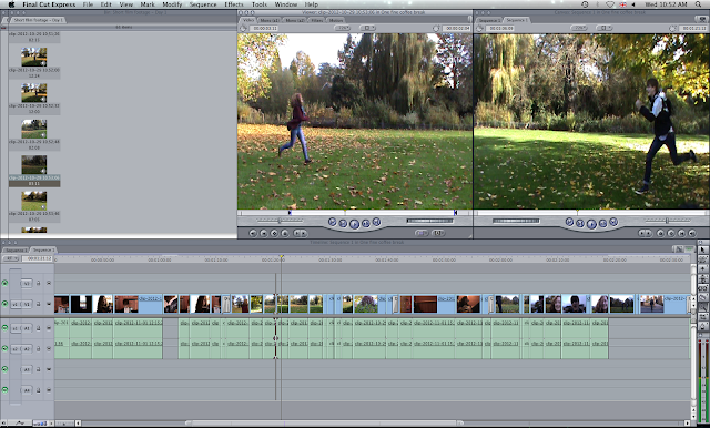
Cutting between Olivia running and Jacob to show it is a simultaneous action. 
At the end of this scene Jacob falls over, this was a bit harder to film to make it look natural. But luckily, Jacob was really willing and gave it several goes until it looked right. (During this time we gathered some spectators.)

To make the action of him falling look alarming to the audience I used shots from two angles, one in front and one from the very long shot position to show where the characters are in relation to each other.

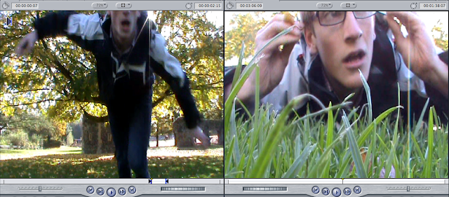
Him falling.                                                                                       On the floor.
After falling my favourite shot so far is featured. I starts with his glasses in focus (in a level angle shot) and close the the camera amongst the grass. He then proceeds to pick them up and place them back on his face as the camera pans upwards changing it to a low angle shot.

The film scene


During this scene the couple are watching a horror film, the female is calm but the male character is scared witless.  This is a case of role reversal, it challenges the audiences expectations of typical character types/conventions.

The first shot is of a DVD cover insinuating what the couple are watching. I chose the film 28 Days Later because it is a well known zombie film that my target audience will probably of heard of if not seen. The camera tracks from right to left. Originally the shot tracked the other way, however the following shot of the couple pans right to left. I wanted the two shots to move in the same direction to help with continuity , making it less disorientating for the audience. It also just looks smoother. I was reluctant to reverse the shot of the couple as it's important to me for the audience to see Olivias character first, I think this make Jacobs characters reaction funnier as it has already been established to the audience she was fine with the film. This plays on the expectation that women are less into horror films than men and that men should be comforting the women hiding behind a pillow, not the other way round.
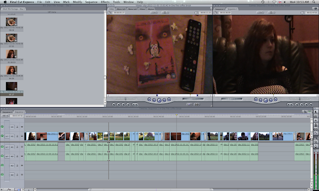
Editing the film scene.


The spinning/car scene


As I said in an earlier post the footage of the male getting hit by a car didn't look right when sped up, hence I decided to put it in at normal speed. This way it looks like slow motion. I will keep it this way in my first edit to get some peer feedback.

Before he gets hit by the car the couple spin. This footage turned out really well and the actors facial expressions (especially Jacobs) are really funny. I have cut between Jacob spinning and Olivia spinning to again like the running signify that they are doing it simultaneously. I then added in the footage I edited when testing this scene on the end.
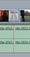
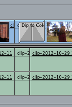


Transitions
As I stated in my previous post I am using fade to white transitions between each scene during the dream sequence to remind the audience that it is a dream and not reality.


What's next?

More editing! This process takes a while but it is well worth devoting the time to it.

Tuesday 6 November 2012

Editing session 1

Today I started editing properly after my tests yesterday. I am going to edit the scenes chronologically as it will ensure my short film flows and makes sense. So I have started with the first scene in the coffee shop.

Scene 1 - Shots 1-20

Continuity and footage problems

I thought this would be straight forward but I had overlooked certain aspects of continuity. I took pride in the fact that when filming I filmed more footage than I needed and did a couple of takes of each shot. This way I should, in theory, have more than enough to play around with whilst editing. However, it doesn't appear this way. Continuity is very important to create a coherent scene. When filming it is hard to keep track of actor positions to make sure they are the same when changing camera position.

During the first 15 or so shots I think I have edited successfully and it flows as though it were one continuous action. This is an example of match on action, when one action take part over several shots.  Some shots were not as good as I'd have hoped, for example Jacobs head is slightly out of frame or the camera isn't overly steady. Finding out the shots aren't steady is incredibly infuriating as I took all the necessary steps to ensure that they were. I can only account it to the quality of my tripod and possibly if I was holding the camera whilst filming the shot, although I don't think I was. The tripod is now broken thanks to Jacob. To his credit he tried to fix it but one of the legs no longer stays in place.

Here is an example of one of my shots that didn't turn out perfectly. The lighting of the above shot of the coffee cup is very dark and low key. However through the magic of Final Cut I can change this. I used the colour correction effect on the shot. Editing the white and black setting allowed me to change the lighting of the shot making it more visible and matching the lighting of the other shots in the scene.
Before (left) and after (right)


Transitions

Between each shot I am just using a straight cut. This doesn't detract from the action and presents clearly to the audience that the scene is uninterrupted.
 
Between this scene and the next (the first of the dream sequence) I am using a fade transition. This signifies the change from reality to imagination to the audience. This is coupled with the camera panning upwards, connoting that Jacobs character is looking  to where a thought bubble would be (were they real).

I am also using the same transitions between scene during the dream sequence. For example between the two characters having the dinner date to the train station scene. This will remind the audience that the images on the screen are figments of the male characters imagination.


 The effect is implemented by a simply applying a pre-set effect in-between two shots.


This is as far as I got today. I am pleased with how it's looking so far. I will continue editing tomorrow.