
Luckily, I had a friend on hand to provide me with some rough instructions. After a while I kind of got the hang of it and managed to mock up this poster.
 I used a photo I took of Jacob using my iPhone and put it into Photoshop. Looking back the photo was bad quality: it is the wrong size meaning I can't now get this poster to A4 without it being blurry. Also Jacob's right eye appears to be wandering off in it's own direction. I definitely need to re-take it. After removing the background and replacing it with plain white I found this thought bubble shape and applied it to the picture using a new layer. This ensured I didn't accidentally alter the previous image.
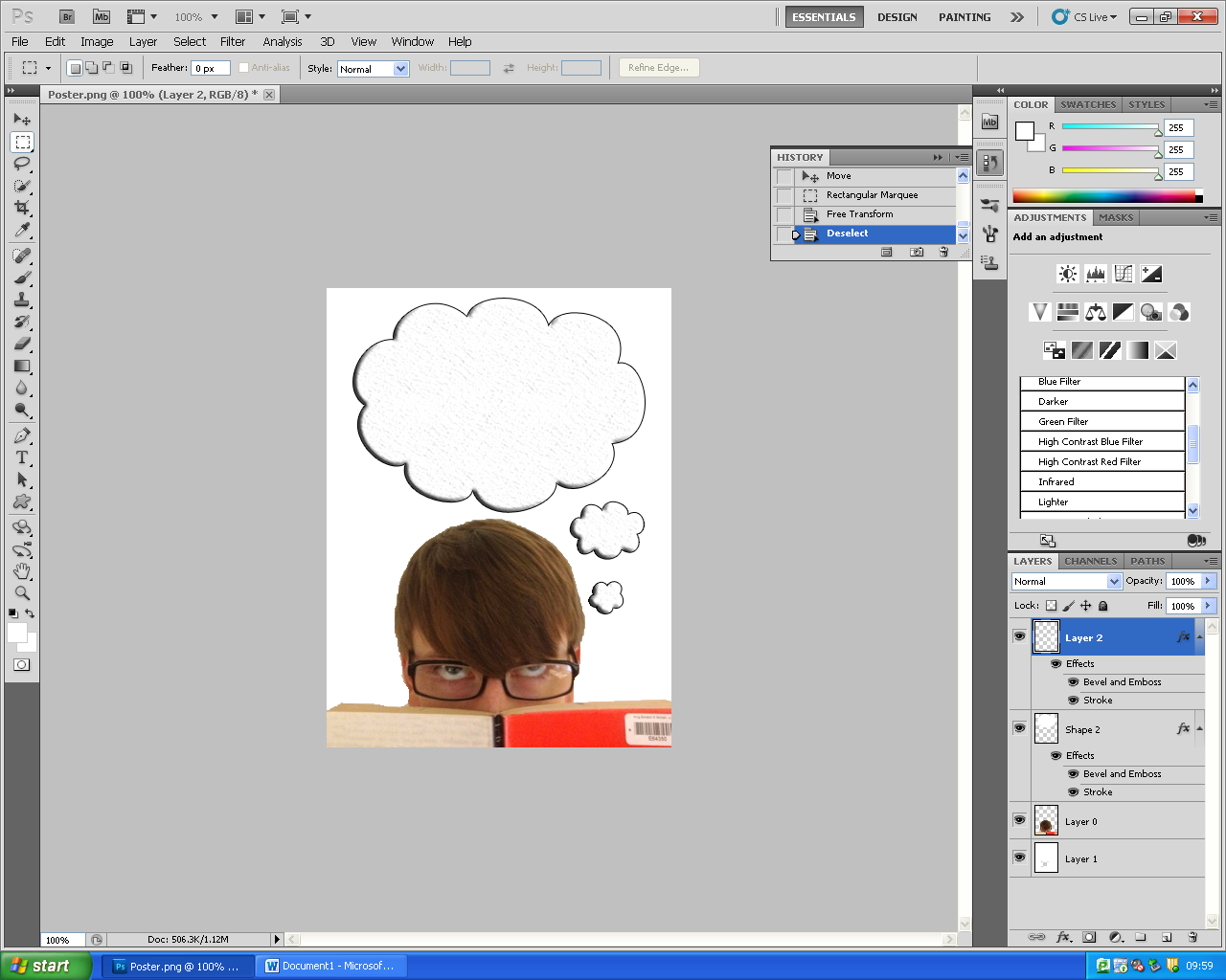

The next thing I did was add the title of the film to the speech bubble. I knew from my research of existing film posters that this should be the largest text on the page as it is most important to the audience. This will not be the final font, it is just serving it's purpose now. I couldn't quite figure out how to download the fonts I wanted into the program. I will try again at a later day, for now this font is fine.
At the minute my poster still holds the same layout as my preliminary sketch and my drawn draft.

Here I have the finished first draft of my film poster. I am really pleased with my efforts, especially as I have no previous experience of Photoshop. This simple poster took me nearly an hour and a half, hopefully next time I will have retained what I have learnt and be able to work more effectively.

- Use a copy of Lord Of The Rings in the photo a that is the book featured in the film. It doesn't really matter but attention to detail never hurts.
- Use a proper photo - As I mentioned this was taken with a phone thus I can't get the image full sized without it blurring I will also use a white background to take the photo so I don't need to remove it. This way I will void any strange looking edges around the photo where the background has been removed.
- I need to remind myself what is featured in a billing block and use the conventional font.
- I might change the texture of the cloud, it doesn't look overly 'cloud like'.
- I need to test out some different fonts to see what works best.
No comments:
Post a Comment